Final Project Report:
Artist:
Sam Pemberton
Artist's Life:
Unknown
Personal Background:
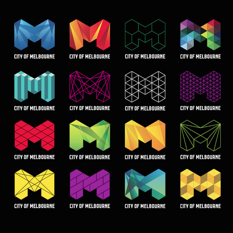
Sam Pemberton studied graphic design at Enmore Design Centre, then went to Billy Blue School of Graphic Arts and concluded there as amulti-award-winner. He is know for recreating the City of Melbourne Logo and is a member of the Australian Graphic Design Association. He is from Sydney, Australia.
Style:
Pemberton's style of artwork is often geometric and simple. He uses lots of repeating patterns, and uses contrast in many of his designs. He does a lot of grayscale work, as well as colorful work.
Philosophy:
Pemberton's work seems to be focused on companies and political work. A piece of political work he did was the redesigning of the City of Melbourne's Logo. He has done many complex projects with many brands.
Influences:
Pemberton has influenced me to create geometric projects and to focus on simplicity. He has inspired me to find a basic idea and create many ideas from the one original idea. He has also influenced me to make a bunch of the same style of work to create a collection of them.
Sources:
Sam Pemberton's City of Melbourne Project
Some of Sam's Art
Sam's Behance Page
Below is Sam Pembertons's image that inspired me.
Compare and Constrast:
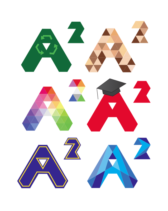
My artwork was to create a logo for Ann Arbor, based of Sam Pemberton's logo for the City of Melbourne. Pemberton's logos were a lot more patterned, they all had a single theme that they stuck with.Mine consisted of some patterns and other designs on my basic logo shape. My logo designs show demographics of Ann Arbor, and Pemberton's designs were more geared towards businesses and organizations in Melbourne.
Personal Artist Statement:
My artwork is six logos to represent demographics of Ann Arbor; recycling, diversity, art, education, U of M, and the Huron River. All six logos use the same basic shape. They use a variety of colors. The colors help to show what each of the 6 logos represent.
